Yep, my slides are useless!
ftisiot
- 6 minutes read - 1235 wordsEvery time someone talks about slides design a great debate is generated. People have opinions and, guess what? Specifically in the area of public speaking, they seem to be quite vocal about them 🤣.
#5 is very, *very*, subjective.
— Bruno Borges (@brunoborges) June 23, 2022
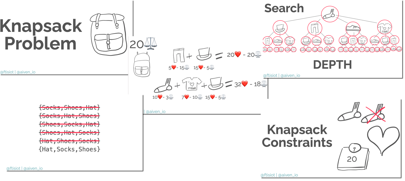
I have a personal preference, which makes my slides pretty useless when shared in the raw format (see here an example). This blog post tries to understand the overall problem and to give some suggestions.

⚔️ What are the parties?
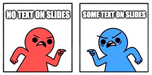
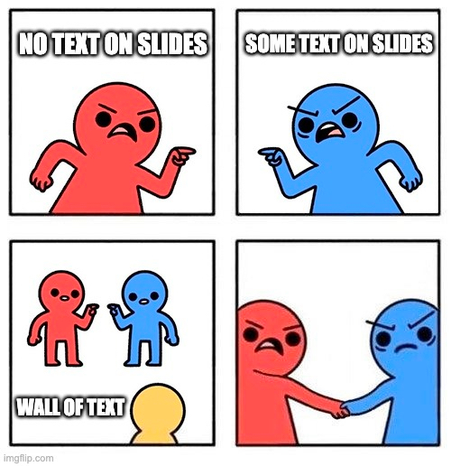
As for every discussion, there are two parties that I would call minimalist and informative.

For the minimalist, slides act as canvas, just showing the background while the presenter is talking. They usually suggest to put a minimal number of words (or even none) in slides and only include visuals.
On the other side, there are the informative people, which state that a bit more text needs to be present, to give people the visual anchors about what points the speaker is covering and include other useful information for the reader.
📜 Is it only a matter of text?
The two parties have different positions, but is it only about the # of characters in a slide? Well… not really, it’s about how different speakers interpret a talk and how much of their content will be self-serviceable.
In the minimalist approach, slides represent only the background, therefore the speaker is the main actor narrating a story, giving context, specifying the needed details. With the minimalist approach the speaker role is crucial to glue the talk together and attendees need complete focus to get the full picture.
On the contrary, the informative structure, gives away more context and information. The speaker role is still crucial to glue the story, but attendees can possibly foresee parts of the talk by reading the text in the slides and the full talk also work when focus is going on and off (Hi mobile phone!).
🎤 Is the minimalist only about speaker’s ego?
From the sentence above, it seems that the minimalist approach is all about putting the lights on the speaker with no benefit for attendees right? Well, possibly not: when you watch a movie, subtitles can be a distraction if you’re not used to them. Think about a talk like a movie, you want to be concentrated on what the speaker is telling you in order to get the best experience out of it!
If you start reading the text on a slide, follow a link and read an article, you lose the focus on what the speaker is saying, and therefore could miss some very important remarks. When thinking about this, it always reminds me about Malcolm in the Middle episode.
👀 Where is the difference?
I feel that, however, the main change comes when you think about the slides deck’s life AFTER the talk!
The minimalist slides are pretty useless by themselves, they require the attendee to watch the talk video (if available) or some other accompanying material. On the other side, the informative approach probably produces a more self-serviceable material, with people being able to grasp the talk content by scanning the text in the slides.
Is this meaning that the informative approach is always better? Well, in my opinion is not or, at least, not always. Even if the informative approach is more self-serviceable, it doesn’t mean that is exhaustive! A slide deck by itself can’t be complete, if a slide deck is containing all the information needed, it means you’re creating a poem and not a presentation deck. Even more, it doesn’t represent or substitute the voice of the speaker: information which is included as a sentence in a deck can be misunderstood if not read with the complete context, which partially comes from what the speaker is saying.
The risk with any kind of deck, is that parts of it can be taken out of context and therefore misused!
🧭 What should you do?
People have their own preference and I’m not here to tell you what to do! You should follow your instinct as content creator:
- Do you like images and no text? Go for it!
- Do you like to have a set of words you’re going to cover? Include them!
- Do you think an extra sentence will help your audience? Add it to the slide!
💁♂️ Some good rules
However, no matter what you think about minimalist vs informative slide design, there are some good rules you might want to follow.

- Avoid wall of text: your attendees are not there to read a poem! Think carefully about everything you’re adding to a slide and ask yourself:
- is it relevant? is it’s a tangent, maybe you can just mention it
- is it absolutely needed? No need to add the “nice to have”
- is it readable? speak/write easy! Avoid long sentence and use common words
- Provide references: are you taking a sentence/piece/image from somewhere? mention it, it’s good etiquette and gives the original creators the credits they deserve.
- Give people links: the worst thing, if you’re interested in something, is not having a place where to dig deeper! Feed people with links to study/know/do more with what you’re covering.
- Prepare additional material: related to the above, prepare a blog/documentation/video covering similar topics so even if the talk is not recorded or not accessible outside the conference, people with the slide deck will be able to find all the required information. Writing a blog post covering the same topics as a talk is both a great way of reusing the content but also making sure that people that don’t have access to the talk video can get the full context of the talk!
- Prepare another deck for sharing: there’s no-one saying that the deck you’re presenting needs to be EXACTLY THE SAME as the one you’re sharing. You might want to have the minimalist approach on stage and the informative one when sharing, it requires a bit more effort but has possibly a better impact.
🤙 A personal take on slide decks
As you saw above, I’m all in favour of the minimal approach, with the following tips:
- Links: if is not strictly needed in a particular slide or the talk, I add all the links at the end in a section called references. This avoids people trying to write the URL while you talk about something else
- Dedicated Page: within the links in the reference, there’ll be one to a dedicated page for the talk (example here). Having a dedicated page allows me to:
- add more/less links
- review links
- add/update content when relevant
- Related blog: almost every talk comes out also in the form of one (or more) blog posts. This allows people who can’t access the video to get the complete picture of the talk.
This is my way of doing things, and it’s not the only or the gold one! I would like to know your experience and what you’re doing better/different to make your decks more effective!
📚 Good references
Some good references that helped me in the past:
- Ricardo Ferreira: How to Create more Effective Developer Content: covering why creating content in multiple formats is more efficient and useful
- Luiza Nowak: How to make better tech presentations: covering how to improve the slide deck creation
- Robin Moffatt: Quick Thoughts on Not Making a Crap Slide Deck: get few tips on slide design